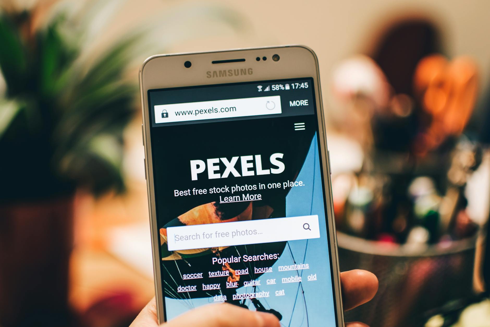
Most Shopify store owners treat their mobile blog like a mini-version of their desktop site. This is a mistake. It is like trying to play a grand piano inside a phone booth. You might be able to hit a few notes, but the experience is cramped, awkward, and ultimately, nobody wants to stick around for the second half of the show.
In 2026, your mobile site is no longer the "alternate" version of your store. It is your store. For most of you, 85% of your organic traffic will arrive via a device that fits in their pocket. If you are designing for the desktop first and "optimizing" for mobile later, you are building a system that is designed to fail. You are prioritizing the 15% at the expense of the 85%.
I like to think of mobile UX as a series of small wins. Every millisecond of load time you shave off, every unnecessary pop-up you delete, and every sentence you shorten is a vote for a better user experience. When you stack enough of these small wins together, you don't just get a better blog. You get a growth engine that runs while you sleep.
The Architecture of the Thumb
Think about how you hold your phone right now. Your thumb does 90% of the work. It is the primary cursor of the modern age. Yet, many Shopify blogs are built like they expect you to have the precision of a neurosurgeon using a mouse. We put tiny "Read More" buttons in the corners and hide the search bar behind a microscopic magnifying glass.
If you want to win in 2026, you need to design for the "Thumb Zone." This is the arc of comfortable movement for a human thumb. Important actions—like adding to a cart or clicking a related article—should live in the center or bottom third of the screen. Anything placed in the top corners is essentially dead space. You are asking your customer to perform digital gymnastics just to read your content. They won't do it. They will just leave.
Stop looking at your blog on a 27-inch monitor. Open it on your phone. Try to buy your own product while standing in line for coffee. If it feels frustrating, it is frustrating. Mobile-first SEO isn't just about keywords; it's about the physical ease of consumption.
Related reading: Interactive Blogging: The End of the Monologue
Speed is a Feature, Not a Metric
We often talk about site speed as a technical hurdle to clear for Google. We check our Core Web Vitals and move on. But speed is more than a number. Speed is a signal of respect for your customer's time.
When a page takes four seconds to load, you aren't just losing SEO points. You are telling the visitor that your tech stack is more important than their attention. In 2026, the threshold for patience has essentially hit zero. If your blog doesn't feel instantaneous, it feels broken.
A simple way to fix this? Radical subtraction. Remove the heavy image sliders that nobody clicks. Ditch the custom fonts that take 500ms to fetch from a server. Optimize your images until they are as lean as possible. In the world of mobile commerce, the fastest site usually wins, even if the content is slightly shorter. You cannot rank if the user bounces before the first paragraph appears.
The Death of the Sidebar
I have a confession: I used to love sidebars. They felt like a great way to show off "Recent Posts" and "Popular Categories." But on mobile, the sidebar is a ghost. It gets shoved to the bottom of the page, below the content, where exactly 0.01% of people ever see it. Or worse, it creates layout shifts that make your text jump around like a caffeinated squirrel.
In 2026, the sidebar is dead. Your blog should be a single, focused column of value. If you want people to see other posts, put them *inside* the content. Use "Related Reading" breaks like the one I used above. This keeps the user moving forward through the story rather than trying to look left and right on a screen that is only three inches wide.

The Two-Sentence Rule for Formatting
Wall of text? That is the quickest way to kill your organic growth. On a desktop, a five-sentence paragraph looks normal. On a mobile phone, that same paragraph looks like a daunting mountain of words. Most people won't even try to climb it.
My rule is simple: If a paragraph is longer than two or three sentences, break it. Use bullet points. Use bold headers. Give the reader's eyes a place to rest. You want to create a sense of momentum. Reading your blog should feel like sliding down a hill, not trekking through mud.
Humor me for a second: Go look at your latest blog post on your phone. If you have to scroll more than twice to get past a single block of text, you are losing people. White space is your friend. It isn't empty; it's room to breathe.
Related reading: The Click is a Lie: A Gladwellian Guide to Dominating 2026 Shopify Zero-Click Search
Atomic SEO: Specificity Wins
Many Shopify owners try to rank for massive, generic terms like "Best Coffee" or "Organic Skincare." In 2026, that is a losing battle. The big players with million-dollar budgets own those terms. But they don't own the specifics. They don't own the "long-tail" questions that real humans ask while they are on the go.
Mobile search is often highly specific and intent-driven. People search for things like "how to remove coffee stains from a white silk shirt at a restaurant" or "is this specific ingredient safe for sensitive skin during winter." This is what I call Atomic SEO. You are looking for the smallest, most specific problems your customers have and solving them with one focused blog post.
When you solve a specific problem, you build immediate trust. And trust is the ultimate currency of e-commerce. A customer who finds you through a specific answer is ten times more likely to buy than someone who finds you through a generic search. They don't just want "information"; they want *your* solution.

The beauty of this approach is that it scales. One specific post might only bring in 50 visitors a month. But 100 specific posts bring in 5,000 high-intent visitors. This is how you build a moat around your business. You don't outspend the competition; you out-serve them at the atomic level.
Related reading: The 2026 Shopify Guide to High-Conversion Buying Guides
The Contrarian Take: Stop Writing for Everyone
Most SEO advice tells you to make your content as accessible as possible. I disagree. If you try to talk to everyone, you end up talking to no one. Your blog should have a personality. It should have an opinion. It should even be okay with annoying the people who aren't your customers.
On mobile, people are scanning for a "vibe." Within three seconds of landing on your page, they should know if you are the kind of brand they want to be associated with. Are you funny? Are you clinical? Are you a rebel? Use your voice. Take a stand. A blog post with a strong opinion will always outrank a bland, AI-generated summary of facts. Google’s algorithms are increasingly prioritizing "Information Gain"—which is just a fancy way of saying "tell us something we haven't heard a thousand times before."
Frequently Asked Questions
Does blog length matter for mobile SEO in 2026?
Word count is a secondary metric. What matters is "time to value." If you can solve a problem in 400 words, don't write 2,000. However, for complex topics, longer content still ranks better because it provides more context. The key is to make that long content easy to scan with headers and lists. Quality over quantity, always, but depth is still rewarded by search engines.
Should I use pop-ups on my mobile blog?
Generally, no. Google explicitly penalizes "intrusive interstitials" that cover the main content on mobile. If you must use a lead magnet, use a slide-in or a banner that takes up less than 20% of the screen. Better yet, embed your call-to-action naturally within the flow of the article. If the reader is enjoying your content, they won't need to be slapped in the face with a 10% off coupon to stay interested.
How do I handle large images on mobile?
Use WebP format and lazy-loading. Shopify does a decent job of this automatically, but you should still check your manual uploads. An image that looks great on a 4K monitor is just dead weight on a mobile phone. Aim for image file sizes under 100KB whenever possible. Remember: speed is the foundation of the user experience.
Is voice search different from mobile search?
They are cousins. Voice search is more conversational and uses longer phrases. Mobile search is often shorter but highly local. By writing in a natural, human voice (the way you'd talk to a friend), you naturally optimize for both. Don't overthink it—just write like a person, not a textbook.
Building the System
The biggest hurdle to organic growth isn't a lack of knowledge. It's a lack of consistency. You know you need to blog. You know it needs to be mobile-friendly. But you also have a store to run, orders to pack, and a life to live. Most store owners start a blog with high hopes, write three posts, and then let it sit for two years.
Success doesn't come from one-off heroic efforts. It comes from systems. You need a way to produce high-quality, mobile-optimized content consistently without it becoming a second full-time job. You need to focus on your products while the organic traffic takes care of itself.
If you want to put these mobile-first strategies into practice without the massive time commitment, that is exactly what we built Rank My Shop to do. We help Shopify stores automate the heavy lifting of SEO-optimized blogging, so you can focus on the 1% of tasks that actually move the needle for your business.
Ready to start growing? Check out Rank My Shop on the Shopify App Store.